Sunday, September 4, 2011

A Serious "Pop" of Color


When we moved in to this house, one of the things I liked was the way the previous owner had painted the fireplace- unfortunately, it was not a color that worked for us. (This picture is from VERY early on- one of our first rounds of photos taken in the house if I am not mistaken.)

Even though I was sure that I had to change the color, I knew I definitely wanted the fireplace to stand out. I knew that we would re-paint the brick to match the color we had chosen for the trim (Swan White), and quickly decided I wanted the fireplace to tie in with the backsplash tile that will be going in the dining room buffet area and kitchen. Now, the tiles for the backsplash were chosen when we were still in Arizona planning the space- and purchased soon after we moved in. We ordered all of the tile from glasstileoasis.com, and have been very happy with what we have received. So, here you go... a preview of the backsplash!!!!!

(Just imagine this with the white cabinets..... ahhhhhh pretty!) The picture is a little decieving, the tile is actually a bit darker when placed on the wall.. but you get the general idea. You have no clue how excited I am for the day we can install this beautiful tile!!!

So, the plan was to find a color that matched the tile for the fireplace and also the interior of the front door. Based on the color chips, we chose a Behr color called Brilliant Sea. On the card, it was perfect. In person, it was a bit much. The door looked OK, but that also had to do with the fact that it was in shadow. With all of the afternoon sun that we get in the living room, the fireplace looked almost fluorescent.


I wanted a pop of color- not a punch in the face. At first, we thought maybe it looked so bright because the room was empty. We decided to live with it for a while and see if it grew on us. It did not. It soon became apparent that I would not be able to concentrate on anything else until we fixed that color. We went through more paint chips, also taking the tile in to the Depot to be sure we hadn't missed a color along the way. We ended up deciding on a color called Havasu (a little tribute to AZ too!), which was actually the next step darker from our original choice of Brilliant Sea. On the chip, it seemed much too dark, but once we had it up we realized it was the exact color we had been going for. It's hard to see a huge difference in the photos- but trust me- it is much, much better!


And another bonus- we have extended the finished floors down the hallway, throughout the dining room and through about half of the living room! We were able to *finally* take our couches out from their plastic tent- and got the TV set up just in time for FOOTBALL SEASON! We also were able to get rid of the awful vertical blinds in the living room! YEA!!!


Lesson learned: If you're not sure- go ahead and spend the $3.00 on actual paint samples to test... otherwise you will end up stuck with a gallon of Brilliant Sea in your garage.

Architectural Detail

Of the many facets that give a house 'charm' one of the more important is Architectural Detail. Portland and the surrounding areas were largely built in the late 1800's and early 1900's, and the overwhelming majority of period houses in this area fall into the Craftsman style of architecture. Because they were built by hand, often by small groups of very talented and experienced craftsmen, they contain details that act as a testament to the builders skill. Exposed corbels and rafters, exquisite built in cabinetry, often hidden storage, all executed with the finest skill the builder could muster. One would imagine that, in an era of craftsmanship, these details would be talking points, giving credence to the avowed skills of the homebuilder, and building his credibility and reputation as a carpenter.

Our house is not one of those...

This home was built (quite solidly) in 1973, in a later era of expansion and sub-development. Additionally, it has been remodeled more than once, and by persons of, ahem, 'questionable skills.' I try to refrain from screaming expletives about useless hacks... sometimes I fail.

This is all background to the point at hand, which is that we wanted to, in our design, add a few Craftsman style details to the house, to add some charm. Exterior details are a later possibility, but that is down the road a ways. One of the first details we decided to add were arched beams on the interior.

In previous posts, we have touched on the two interior beams that Rachel and I installed. These two beams were necessary to carry the load of the ceiling, although they do not have any true structural or roof load. Accounting for the shape of the room and the placement of the beams, we have used them to demarcate the dining area from the rest of the living space, and adding arches to the finished beams helps to give the room a charm and detail that helps to justify the beams. Where otherwise there would be two visible beams with no major purpose other than support, we now have an architectural detail that defines the dining room and adds grace and charm to our living space.

Arches are not particularly complicated, but they are tricky. If one does not figure all the details out beforehand, one runs the risk of a too abrupt transition to straight, or uneven arches, with different lengths and/or radius between one detail and the next. My method of creating these arches was to build the four units, identical in measurement, on the ground, then fasten them into the corners. I worked out (mathematically) what the radius should be in order to use 24" pieces of flexible corner bead (we'll get to that in a minute) and worked backward from there to establish the shape of the side pieces.

The corner units are made of 2x4s, ripped to the correct width, with a radius cut piece of particle board attached to both sides. OSB and plywood are also usable for the sheeting parts, but particle is what I had on hand. I cut all the pieces to be the same size, and assembled them with screws.

After the corners were built, they were installed on the bottom of the beams, in all four corner (both sides of the post and both wall attachments). The sheetrock was then hung on the beams and walls, excepting the curved portions of the arch. The curves were covered with several layers of High Density 1/8" hardboard. Each layer of hardboard was attached to the curves and beam to hug the plywood arch, with the final layer being installed rough side out, to hold drywall mud.


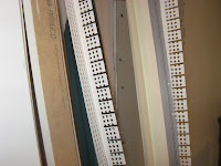
At this point, the project is ready for corner bead. While it is possible to make preformed metal arches out of standard steel cornerbead, it requires very expensive and specialized tools. I elected to use flexible plastic cornerbead for this application. This product is widely available and looks very similar to regular plastic corner, except for one leg of the corner being cut into small lengths. The corner is then carefully bent into place, and attached at the middle, working your way out to the ends and keeping the curve smooth (this is one of the tricky parts). After this arched corner bead is attached, standard straight corner is applied to the rest of the corners.

Next up, drywall mud. One thing to note regarding inside corners such as this, it is almost impossible to mud these in thin layers. The nature of the cornerbead and inside curve is such that you will wind up putting the full depth on at one time. It can be helpful, in situations like this, to use chemically hardening 'hot' mud, as it is less likely to crack while curing in a very thick layer. After several applications and multiple rounds of sanding, we are ready to paint and finish.
What's that behind the arch, you say? That's what we call a teaser, and it's to get you hooked in. Fear not, more posts will be forthcoming!


After paint and finish, we have a beautiful detail that helps define the space, adds character and charm to the overall building, and architectural detail to the house.

It's been a while... Let's talk about cabinets!


It's been over a month since we have had a chance to update the blog- and we apologize for getting behind! Just because we haven't been posting doesn't mean we haven't been working on the house, though... so I will do my best to catch up.

One of the big things that happened in August was that we bought our cabinets!!! We decided to go with Ikea cabinets. Because the cabinets are actually made from metal and composite material, and only the faces are actually nice wood, these cabinets are SIGNIFICANTLY cheaper than, oh let's say all cherry cabinets that we had in the condo in Phoenix. We had originally budgeted about $7,000 for all of the cabinets, looking at warehouse and discount stores. The issue with these stores is that you essentially only have the options in front of you. They may not be the exact shapes/sizes you need, or not the right color. When we went to Ikea to browse, we found a style that was exactly what I had pictured in my mind- and had all of the features we wanted, such as soft close doors and drawers, glass front-paned doors for the dining room buffet area, etc.

After deciding what face type we liked, we headed home to design our cabinet layout. Ikea has a program on their website that allows you to design your rooms and print out an item list as well as a 3D rendering. The program itself is a HUGE headache, but completing all of this at home was incredibly beneficial. That way, I could be on the computer looking at options, while Tim could run over to the room and double/triple check measurements. Once we were finally happy with the design, we headed in to the store to purchase the cabinets. This proved to be a headache in and of itself, but, in the end, we completed the purchase and got cabinets for the kitchen, a dining room area buffet and the vanity area in the master bedroom for under $5000. Oh- and that also includes the hardware, a new (farmhouse!) kitchen sink and faucet.

Thankfully, we had Ikea deliver the cabinets- it would have been multiple trips even with Tim's truck. We managed to clear out about 1/2 of the garage and anxiously awaited the delivery. When it finally came, we went through each item, cross referencing with our list, 3 times in order to be sure we had everything and the order was correct. This was quite a process, especially when you consider the crazy names that Ikea gives everything. Luckily, the order was fine. As part of this process, we also divided everything by room- giving an area to the dining room cabinets, kitchen and master.

The first set of cabinets to be installed were in the master bedroom. It was only 2 sets of drawers, so by far the easiest to install. For the vanity, we had previously purchased a tiger's eye glass tile for the counter top. Once the cabinets were built and installed, Tim added a counter in particle board, and a strip of fascia above the seating area. We were also able to install the vanity sconces!

The next step was to tile! This was my first experience laying tile, and I have to say it was not that difficult. I'm sure it also helps that we were tiling a flat surface rather than a wall- good practice for the backsplash and master bathroom! Basically, you spread out a layer of thin-set mortar, using a 1/4" notched trowel to get a consistent thickness. Then, you lay the tile down. The glass tile came in 13" X 13" sheets, so it was as simple as putting the large squares down evenly. We did have a few cuts to make, and rather than using a tile saw, we managed to find my stained glass equipment and used the "chompers" to break the glass. Once the tile is placed, we pressed it down into the mortar and allowed it to dry. Finally, we used a sponge to remove any residue from the glass.


The next step was to grout. For this portion of the project, we had a guest star! My parents actually came in to visit, and of course, were put to work! My mom did a fantastic job of grouting the counter. We decided to go with a dark chocolate grout so that the small tiles would look more cohesive and you would not notice each tile as much as the overall effect.

We also were able to hang the mirror- another Ross find- and add the drawer hardware. The hardware for the vanity was actually purchased at the Home Depot. We found a design that mimicked the design of the mirror and antique chair (which is not pictured).
Overall, I am very happy with how the vanity has turned out. Because we have such small bathrooms in this house, it is really nice to have a separate area to get ready in the morning. Additionally, because we installed outlets on either side of the vanity, it also functions as a desk if I need to set up my laptop.